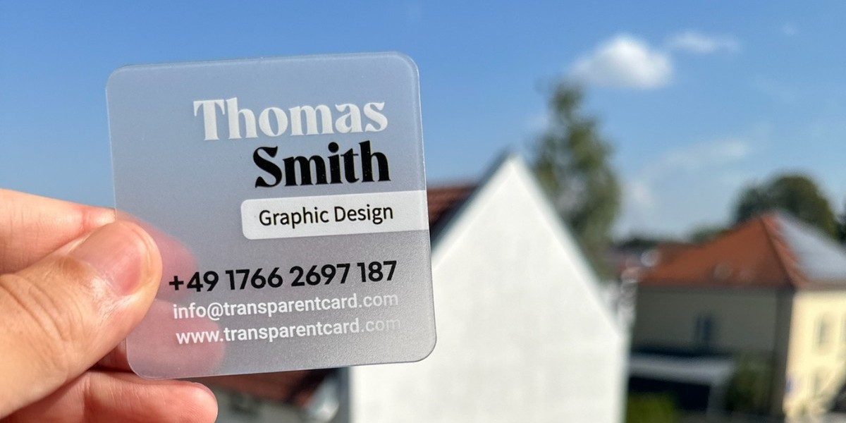
A business card is more than just a piece of paper; it’s a powerful branding tool that communicates your professional identity. While the design, typography, and material of a business card are essential, color plays a pivotal role in how your card is perceived. Colors evoke emotions, convey messages, and influence decision-making—making them a key component in creating memorable business cards.
In this article, we’ll delve into the psychology of colors, how they impact perceptions, and how to strategically use them in business card design to align with your brand’s message and identity.
1. Why Color Psychology Matters in Business Cards
Color psychology is the study of how colors influence human behavior, mood, and perception. When applied to business card design, it becomes a subtle yet impactful tool for communicating your brand values and personality. Here’s why it matters:
- Creates a First Impression: Colors trigger immediate emotional responses, shaping how recipients perceive your brand.
- Reinforces Brand Identity: Consistent use of brand colors across all materials, including business cards, strengthens brand recognition.
- Differentiates Your Card: In a stack of plain business cards, a well-designed card with thoughtful color choices stands out and grabs attention.
2. The Emotional and Psychological Impact of Colors
Each color carries unique psychological associations. Here’s a breakdown of common colors and their meanings:
a. Red
- Psychology: Passion, energy, urgency, power.
- Usage: Red is ideal for bold, dynamic brands that want to evoke strong emotions. It’s often used in industries like food, fashion, and entertainment.
- Caution: Too much red can be overwhelming or aggressive; balance it with neutral tones.
b. Blue
- Psychology: Trust, professionalism, calmness, reliability.
- Usage: Blue is popular among corporate, healthcare, and tech industries. It’s ideal for businesses that prioritize trust and dependability.
- Caution: Avoid making the design too cold or impersonal.
c. Yellow
- Psychology: Optimism, creativity, warmth, energy.
- Usage: Yellow works well for creative, youthful, and energetic brands. It’s often used by startups or companies in the arts.
- Caution: Overuse of yellow can be visually tiring or difficult to read.
d. Green
- Psychology: Growth, harmony, health, sustainability.
- Usage: Green is perfect for businesses in environmental, wellness, or financial industries. It signals prosperity and eco-consciousness.
- Caution: Certain shades may appear too dull if not paired with vibrant accents.
e. Black
- Psychology: Sophistication, luxury, elegance, authority.
- Usage: Black is a classic choice for high-end brands, luxury services, and professionals aiming for a sleek, modern aesthetic.
- Caution: Too much black can feel uninviting; balance it with lighter tones or metallic accents.
f. White
- Psychology: Simplicity, purity, cleanliness, minimalism.
- Usage: White is often used as a background color to create a clean and professional look. It pairs well with bold fonts and bright accents.
- Caution: Excessive white space can feel empty or underwhelming without thoughtful design elements.
g. Purple
- Psychology: Creativity, wisdom, luxury, spirituality.
- Usage: Purple is suitable for brands that want to convey creativity, exclusivity, or a sense of mystique. It’s common in beauty, wellness, and creative industries.
- Caution: Overuse can make the design feel overly flamboyant.
h. Orange
- Psychology: Energy, friendliness, enthusiasm, warmth.
- Usage: Orange is great for brands that want to appear approachable and vibrant. It’s commonly used in entertainment, marketing, and retail.
- Caution: Too much orange can feel juvenile or overwhelming.
i. Pink
- Psychology: Compassion, femininity, romance, playfulness.
- Usage: Pink is ideal for brands in beauty, fashion, or wellness, as well as brands targeting a predominantly female audience.
- Caution: Avoid limiting your audience by reinforcing gender stereotypes.
j. Gray
- Psychology: Neutrality, balance, professionalism, sophistication.
- Usage: Gray works well for conservative, professional industries like law or consulting. It conveys maturity and stability.
- Caution: Overuse of gray can make a design feel dull or uninspired.
3. Using Colors to Align with Your Brand Identity
Your business card should be an extension of your brand. To ensure that your color choices align with your identity:
Understand Your Brand Values: Identify the emotions and qualities your brand represents. For instance, a financial advisor may want to emphasize trust and stability (blue or green), while a graphic designer may focus on creativity (purple or yellow).
Consider Your Target Audience: Choose colors that resonate with your audience’s preferences and cultural associations. For example, bright, bold colors may appeal to younger audiences, while muted tones may resonate with corporate clients.
Stay Consistent: Use colors that match your logo
